


Daniel Okafor, Senior Health and Science Editor.
Most women have a drawer of nearly-empty concealer tubes, each bought because the last one looked wrong by lunchtime. You stand at the bathroom mirror, pat a little under each eye, and by the time you reach the hallway it has settled into every line you own. The question you actually type into a search bar is rarely “best concealer”. It is closer to why does mine crease, or why does hers look flawless and mine doesn’t.
Here is the one fact worth knowing before anything else: concealer failure is rarely about the brand. It is almost always about three things you can judge yourself in under a minute, in a shop or at your own bathroom mirror: undertone, texture, and how much product you are actually putting on. This guide walks through each of them, what is genuine chemistry and what is marketing noise, so you can judge any concealer on the shelf at Boots or Superdrug without needing anyone else’s opinion.
- Undertone decides the match, not the shade number on the tube: two concealers labelled “medium” can sit completely differently if one is warm and one is cool.
- Texture, not the coverage claim on the box, decides whether it creases: a heavy, emollient-rich formula will pool into fine lines no matter how well it matches your skin.
- A thin layer, set properly, outperforms a thick one almost every time: most creasing and cakiness comes from applying too much, not from the product being wrong.
Finding Your Undertone In Daylight
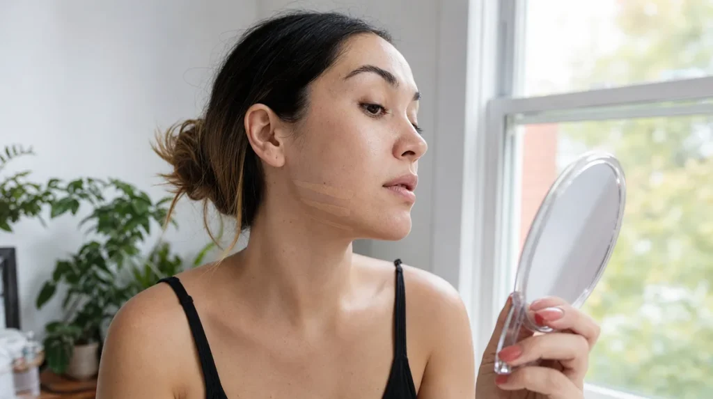
Shop lighting is designed to flatter clothes and shelves, not skin. Fluorescent strip lighting tends to flatten warm and cool tones into a single, misleading glow, which is why a concealer that looked perfect at the till can look chalky or orange by the time you’re outside.
The fix is simple and takes under a minute. Swipe two or three candidate shades in a thin line along your jaw, not the back of your hand, and walk to a window or step outside. Daylight is the only light that tells the truth. The shade that seems to vanish into your skin, rather than sitting as a visible stripe, is your match.
Think of it the way decorators choose paint. Nobody picks a wall colour under a shop’s spotlights; they take the swatch home and look at it against the actual wall, in the actual light, at different times of day. Skin works the same way: it changes slightly from morning to evening, and a shade chosen in good daylight will forgive you more than one chosen in a changing room.
The mistake almost everyone makes is matching to the inside of the wrist, which is often several shades different from the face and neck. Match along the jaw or cheek instead, where the concealer will actually sit.
Reading The Label Like A Chemist
Ingredient lists are ordered by concentration, from most to least, by law. The first five ingredients after water tell you what the product is actually built from; everything after the first ten or so is usually present in trace amounts, there for texture, scent or preservation rather than effect.
Marketing words sitting on the front of the packaging are a different matter entirely. Terms such as “clinical strength” or “dermatologist formulated” are not regulated descriptions in the way that, say, SPF numbers are. They can mean a great deal, or very little, depending on the brand. The only way to know what you are actually buying is to read the ingredient list on the back, not the claim on the front.
Publications such as Good Housekeeping have, for decades, built their reputation on exactly this kind of practical label-reading, testing products in a kitchen or on real skin rather than taking a marketing claim at face value. It is worth borrowing that habit for yourself: turn the tube over before you believe anything printed on the front.
A quick self-test while you are reading this: find a concealer you already own and look at the first five ingredients. If you do not recognise most of them, that is normal. What matters is whether the product behaves the way you need it to on your own skin, which no label can fully predict.
Why Concealer Creases
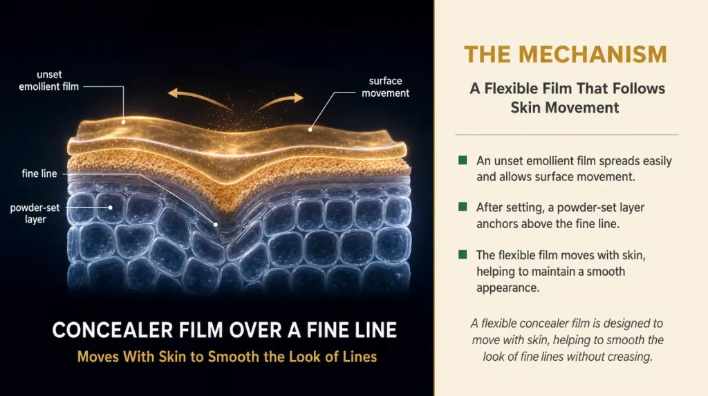
Creasing happens for a mechanical reason, not a mysterious one. Heavier, more emollient formulas sit as a soft film on the skin’s surface rather than binding into it. As your face moves through the day, talking, blinking, smiling, that film gets pushed by the skin beneath it and collects in the grooves where the skin folds most, usually the fine lines under the eye or around the nose.
It behaves rather like icing on a cake that has not had time to set. Smooth it on and it looks perfect; move the cake before it firms up and the icing pools into every dip and seam.
Setting powder works by drawing a small amount of moisture out of that top layer, firming the film so it moves less. Applied with a light hand, in thin layers, and set promptly rather than left to sit wet, most concealers crease far less than their reputation suggests.
The mistake that causes the most visible creasing is applying a thick layer in one go to “really cover” dark circles. A thicker layer takes longer to set and has more volume to migrate into lines. Two thin layers, each set lightly with powder, almost always outperform one heavy one.
Why Matching Concealer To Your Foundation Is Not The Whole Answer
A common shortcut is to simply buy the concealer in the same named shade as your foundation, assuming consistency across a brand’s range guarantees a match. It often does not. Foundation is designed to blend evenly across larger areas of the face; concealer is usually asked to do something more specific, either matching skin exactly to disappear, or sitting slightly lighter to brighten a shadowed area such as under the eye.
These are two different jobs, and a single shade rarely does both well. A concealer bought purely to match foundation can end up too warm, too pink, or too light once applied specifically under the eye, where the skin’s own undertone is often more visible than elsewhere on the face.
The better approach is to test the concealer against the area it will actually be used on, not against the foundation bottle. Pat a small amount under the eye, let it sit for a minute, and check in daylight whether it brightens without turning grey or orange. If it does either, the shade is wrong for that specific job, regardless of how well it matches your foundation elsewhere.
Colour Correcting: What Is Genuine And What Is Marketing
Colour correction rests on a real, well-established principle: opposite colours on a colour wheel neutralise each other. A peach or orange-toned corrector can reduce the visible blue-purple of under-eye shadows in the same way an artist mixes a touch of orange into a blue paint to dull it down. Green-toned correctors work the same way against redness, since green sits opposite red on the wheel.
That part is genuine colour theory, not invention. What tends to be marketing is the suggestion that a corrector will “erase” a concern entirely, or that more intense pigment always means better correction. In practice, a thin layer of the right opposite tone, blended well and followed by a normal concealer on top, does most of the work. A thick layer of corrector left unblended usually just adds a second colour problem rather than solving the first.
Terms like “colour-correcting technology” on packaging are often describing exactly this ordinary colour theory, dressed up as something more technical than it is. There is nothing wrong with the product; the language is simply doing some of the selling for it.
A simple self-test: dab a small amount of a peach or orange corrector on the back of your hand next to a slightly bluish bruise or vein, if you have one. If it visibly softens the blue tone, the principle is working as colour theory predicts.
Judging Coverage Honestly
Coverage claims on packaging, “full”, “medium”, “buildable”, describe intent rather than a guaranteed result, since the same formula will behave differently on dry skin than on oily skin, and differently again depending on how much is applied.
A fairer test than reading the box is a short one you can do at home or even in a shop. Apply a small amount to the back of your hand in one thin layer and check how much of your skin’s natural colour still shows through. Add a second thin layer and check again. This tells you, practically, how many layers you would need on your face to reach the coverage you actually want, which is more useful information than any word printed on the packaging.
It is also worth checking the result again after twenty to thirty minutes, since some formulas oxidise slightly as they meet the air and the oils on skin, shifting a touch warmer or darker than they first appeared. A concealer that looks right immediately but turns orange after half an hour is not a mystery fault; it is a known behaviour of certain pigment and oil combinations, and testing it on the hand first avoids an unpleasant surprise on the face.
The mistake to avoid is judging coverage in a shop mirror at an angle, under lighting designed to be flattering. Step towards a window, or a door, before deciding.
Where Cheaper Formulas Genuinely Cut Corners
Not every low-cost concealer is poorly made, and not every expensive one is excellent, but there are a few places where cost differences tend to show up honestly rather than as scandal.
Pigment dispersion is one. Spreading colour pigment evenly through a formula is a genuinely more demanding manufacturing step, and formulas that skip it can look patchy, with tiny flecks of concentrated colour visible close up, rather than a flat, even tone.
The base oils and emollients used are another. Cheaper bases can oxidise more quickly once exposed to air and skin oils, which is part of why some inexpensive concealers shift shade within an hour of application, more noticeably than pricier equivalents.
Finally, mattifying or oil-absorbing ingredients such as silica are often present in smaller amounts in budget formulas, which is part of why some cheaper concealers feel greasier by midday and move more readily into fine lines.
None of this means a lower-priced concealer will necessarily behave badly. It means these are the specific, checkable places where a manufacturer’s budget shows up in performance, and they are worth testing for directly rather than assuming price alone tells you the answer.
Patch Testing And Sensitivity
Damp British winters and central heating dry skin out considerably more than cold weather alone, and dry, slightly compromised skin reacts to new products more readily than well-moisturised skin does. A concealer that suited you comfortably in a mild September can occasionally feel different, tighter or more prone to flaking, once the heating goes on in earnest.
A patch test remains the simplest safeguard. Apply a small amount to the inside of the forearm, leave it for twenty-four to forty-eight hours, and check for redness, itching or swelling before applying anywhere near the eyes, where skin is thinner and more reactive than almost anywhere else on the face.
If you notice stinging specifically around the eye area but not on the patch test site, this is common and usually relates to the thinner skin there rather than a true allergy, though a pharmacist at a high-street chemist can advise further if irritation persists.
This is a sensible habit at any time of year, but worth repeating whenever you switch to a new formula, rather than assuming a product that suited your skin in summer will necessarily suit it once winter heating dries the air indoors.
Knowing When To Replace Your Concealer
Most concealers carry a small jar symbol on the packaging, an open lid with a number followed by “M”, showing the period after opening in months: 6M, 12M and so on. This is the realistic shelf life once air has reached the formula, not the unopened shelf life.
Liquid concealers, which contain water and are therefore more hospitable to bacteria, generally sit at the shorter end, often around six to twelve months. Thicker, waxier stick or pot formulas can last a little longer, though a change in smell, texture or colour is a clearer signal than any date, and should be trusted over a calendar.
The mistake many of us make is keeping a liquid concealer for years because only a small amount has been used. Age changes a formula’s performance even before anything looks obviously wrong, with pigment separating slightly or the texture thickening, neither of which gives the smooth result you remember from when it was new.
Key Takeaways
Undertone, tested in daylight, matters more than any shade name on the tube. Texture decides creasing far more than price does. A thin, well-set layer will almost always look better by the afternoon than a thick one applied in the morning. Colour correction has a real basis in colour theory, used in small amounts; marketing claims beyond that are worth reading sceptically. And the small jar symbol on the packaging, not the date you bought it, tells you when it is genuinely time to replace what you own.
A Quick Checklist Before You Buy
- Test the shade along your jaw in daylight, not under shop lighting
- Check the ingredient list, not just the claim on the front of the box
- Apply a thin layer first; add a second only if needed
- Set lightly with powder rather than leaving it wet
- Patch test on the inner arm before using anything new near the eyes
- Check the period-after-opening symbol and replace liquid formulas within six to twelve months of opening
This article is for general information only and does not replace advice from a qualified dermatologist or pharmacist.
Individual results vary from one skin type and formula to another.